Paytm Postpaid
Pen & Paper, Sketch, Illustrator, After Effects
Buy Now Pay Later inside Paytm — it had to feel as simple as UPI, not a separate lending product.
Context
When I joined in October 2018, BNPL was new in India and most users did not know what Postpaid was or when they had to repay. Paytm already had recharges, travel, movies, and more — the opportunity was to make Postpaid the default way to pay in that ecosystem, not another option in a long list.
Research
We scanned Twitter and YouTube (core audience 16–24). People asked what “Shop now, Pay Later” even was, hit low limits fast, and were frustrated when rejected without a clear reason — there was no credit bureau in the loop.
We skipped classic personas at Paytm’s scale and designed for use cases: checkout, repayment, and making Postpaid the main payment method in-app.
Focus: simplicity, education, and clear limit information.
Design
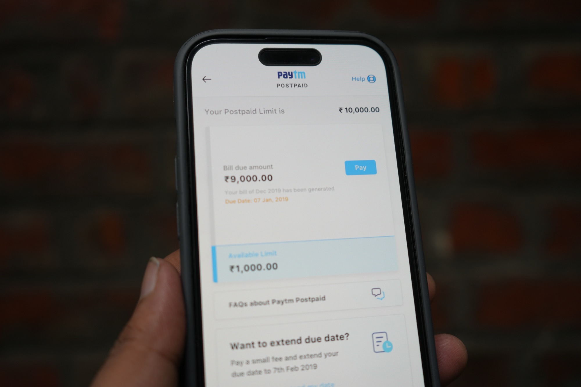
Most flows were fine; the home dashboard was not. I sketched on paper and explored wireframes for the home experience.
I used a bottle metaphor on my desk — total limit as the bottle, available balance as the water level.
The shipped dashboard centered on spend limit, pay early, FAQ, and help. Full gamification did not ship, but the team kept the visual spend-and-repay idea.
Outcome
Clearer limit and repayment UI across onboarding, spend, and account settings — with motion to explain the product in marketing and internal reviews.