 Loop Health2025
Doctor on Demand
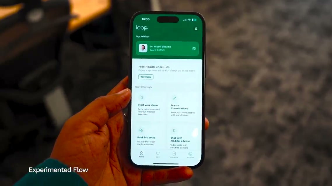
Doctor on Demand started as an experiment — and shipped as the first release in Live on Loop: Member Edition, five features in five days. I led the product design and design-engineered the iOS flow from that first bet through launch. The GP experiment drove a 30% conversion lift.
The problem
We kept seeing the same pattern: members had Loop access and still couldn’t get to a doctor on their own. A stressed employee opens the app — sick child, something’s been off for days — and lands on a screen full of doctors to evaluate, slots to compare, and decisions to make before they can talk to anyone.
Most first-time users don’t push through. They close the app, or message a medical advisor to book it for them. Having access to a doctor and actually getting to one aren’t the same thing.
What we heard repeatedly in research: people wanted to know, quickly, whether we could get them a doctor. If we could show that upfront, we believed we could convert them. That hypothesis is what led to the experiment.
The experiment
We launched Doctor on Demand as an experimental feature for General Physician — a scoped bet to answer one question: if we ship a faster path to a doctor, will members actually use it?
We were right to test it first. The experiment drove a 30% increase in conversion — enough signal to justify building it properly and rolling it out wider.
What I owned
As Staff Product Designer & Technologist, I owned interaction design and native prototyping end to end — intent capture, doctor assignment, wait states, and handoff into consultation.
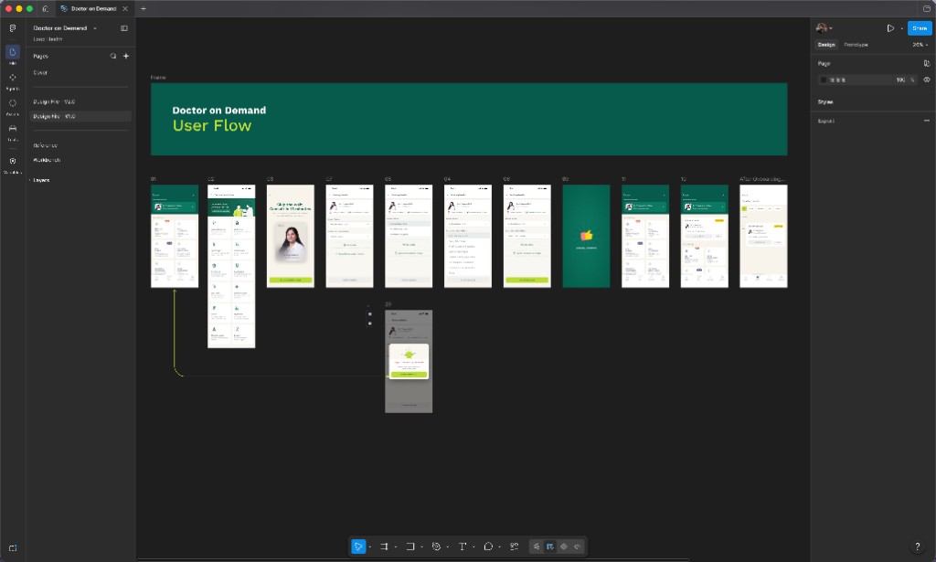
I started in Figma — flow maps and a small clickable prototype to align product and clinical ops on scope. But I have a habit of prototyping in code. The first thing I did was spin up a small SwiftUI environment for myself: I cloned the homepage and a few L2 screens from the app so I could scale prototypes faster without rebuilding navigation every time.
That setup let me iterate on real device feel from day one — not after handoff.
A decision that changed the flow
The PRD called for an introduction screen — explain the feature before members commit.
I lived with the prototype. Used it five to ten times. Slept on it.
The intro felt like friction when someone just wants to know: can I get a doctor right now? I changed the opening — show a doctor available upfront, so intent is clear before anyone reads a paragraph about what Doctor on Demand is.
That wasn’t in the original spec. It came from using the thing I built.
Design engineering
SwiftUI as the source of truth
Keyboard overlap, scroll with long forms, push transitions into the consult screen, how long loading could last before trust broke. Those only show up on a real phone, in code.
States before pixels
I mapped the booking state machine early: intent → matching → wait → assigned → in session → handoff. Engineering and clinical ops reviewed transitions in the prototype before we polished visual design.
Patterns, not one-offs
Loading skeletons, wait-time treatment, doctor-assigned cards, and error recovery as reusable components in the Loop design system — so iOS could ship consistently, not reinvent each state in code review.
Prototype-driven handoff
When a transition felt wrong on device, we changed the spec before it became a production edge case. The SwiftUI build was the argument in review.
Results
The experiment validated the bet: 30% higher conversion on the GP path.
After launch, over 60% more first-time users completed their first consultation — members who used to drop off at browse-and-compare were getting through on the first try.
What I learned
Run the bet before the build
GP scope and a conversion metric first — 30% signal before we committed to the full vision.
The PRD isn’t the prototype
Five uses in SwiftUI killed the intro screen. Members needed a doctor visible, not a feature explanation.
Prototype on device, design the states
Cloning real app screens and getting pending → matched → in session right in code — before pixel polish — is what made this shippable.
Tools
SwiftUI — prototype environment, state-driven flows, production interaction patterns

Figma — early flow mapping and alignment prototypes
Cursor — AI-assisted coding — faster SwiftUI prototyping and scaling the clone environment