 Loop Health2025
Care Tab
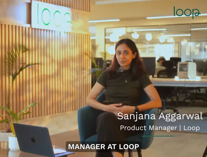
I designed Care Tab end to end — insurance, diagnostics, and primary care in one health timeline. Launched for nearly a million members — the first time those three pieces show up as one integrated experience in Loop.
The problem
Loop had the three pieces that matter for continuous care: protection when you need it, visibility into what’s happening in your body, and access to doctors around the clock. But they lived in silos.
Your consultation happened. Your prescription got generated. Your lab results arrived. All separate. All disconnected.
Healthcare in India has consultation apps, pharmacy apps, diagnostic apps — but no infrastructure for continuity. Members couldn’t answer basic questions about their own history when it mattered. A dentist asks which teeth were already treated; the paper card is lost; you’re guessing from memory.
What I owned
As Staff Product Designer & Technologist, I designed Care Tab end to end — the health timeline, dependent records, consultation context for doctors, and the flows that tie prescriptions, labs, and follow-ups back into one chronological view.
This was a pain to ship. The launch post was going live while I was still pulling context from clinical ops, support, and engineering — designing the system and learning what continuity meant in edge cases at the same time. No clean brief; lots of parallel discovery and iteration.
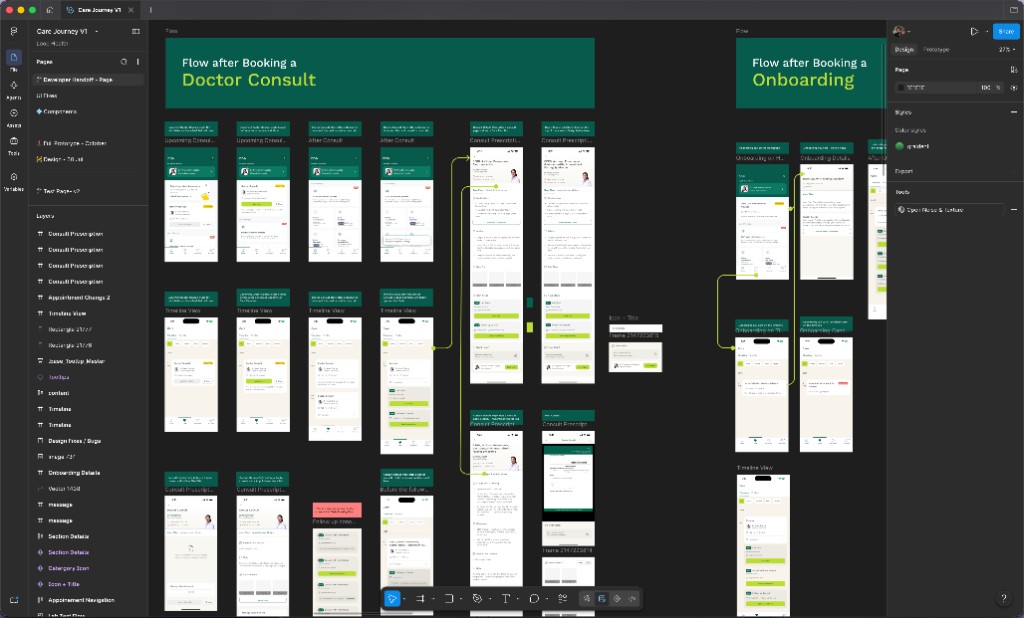
The system
One health timeline
Every consultation with Loop doctors, every prescription, every lab result. Your spouse’s records. Your parents’ medications. Your kid’s vaccination history. Organized chronologically, accessible when you need care.
Context before the call
When you book a consultation, the doctor sees your health profile before the call starts: conditions, medications, recent labs. No more repeating your history from scratch.
Closed-loop follow-through
Doctor recommends a follow-up? Book in one tap. Orders tests? Results flow back into the timeline automatically. Treatment works or doesn’t? The system tracks that too.
Progressive disclosure
The full history exists, but the default view keeps the current thread legible — where you are, what’s done, what’s next — without dumping a lifetime of records on one screen.
Design engineering
SwiftUI on device
A timeline with dependents, labs, and consult handoffs doesn’t survive static mocks. I prototyped scroll, sectioning, and state transitions in SwiftUI so hierarchy and density felt calm on a real phone.
Designing while shipping
Launch pressure meant prototypes were the fastest way to align product, clinical, and eng on what connected care looked like in UI — not slides about a future state.
Patterns for scale
Timeline rows, record types, empty states, and consult-prep surfaces as reusable components so iOS could ship consistently as the data model grew.
Results
Care Tab launched on Loop for nearly a million members — the first time insurance, diagnostics, and care delivery show up as one integrated experience in the app.
Loop is one of the few platforms in India with all three pieces in place. Care Tab is what makes that stack legible to members — not three apps, one timeline.
What I learned
Continuity is a data problem dressed as UI
Incomplete, duplicated, or siloed records — progressive disclosure only works if the backend story is honest.
Launch pressure can be a design method
Designing while the launch post was being written forced fast alignment with clinical ops and eng. Prototypes beat decks when everyone is learning the product at the same time.
Dependents change the whole IA
A timeline that works for one member breaks when spouses, parents, and kids need separate contexts without feeling like four apps in one.
Tools
SwiftUI — timeline prototyping, state transitions, production interaction patterns

Figma — journey mapping, timeline IA, and cross-functional alignment
Cursor — AI-assisted coding — faster iteration while context was still landing